
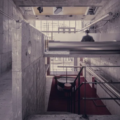
Andersson Bell now occupies a 309-square-metre Aoyama retail shell where architects layered saturated colour to reorganise how the space is read. The project preserves the building’s board-marked concrete and heavy massing, then introduces a deliberate chromatic scheme and reflective finishes that guide visitors from street level through the store.
Co-founder Yohei Terui said the site's strong interplay of mass and void dictated the brief. "It is quite rare to find such a magnificent space in Tokyo, and we were fortunate to have the freedom to take a bold and radical approach to the design," he said, describing how the practice could impose a new layer of presence on the existing architecture. Rather than paint a single tone, the studio mapped a progression: red anchors the ground floor and reads from the street through the frontage, an intermediate orange occupies the middle level, and yellow concludes the ascent, making the colour shift part of circulation rather than decoration.
Alongside pigment, I IN set up glossy and mirrored surfaces to counterpoint the concrete’s tactile roughness. Exposed steel pipes thread through walls and floors as intentional sculptural elements, lacquered display cases and polished tables introduce reflective planes, and a sheet of glass in the floor multiplies light and colour across the 309-square-metre retail shell. Those reflective touches intensify the chromatic sequence and create changing visual relationships between product and structure as a customer moves through the store.
Furniture was treated as an extension of the architecture. The studio custom-made every piece for the fit-out so fixtures would feel integrated with the scale and character of the space; Terui said the intention was for the objects to "merge into one" with the interior. I IN, founded by Terui and Hiromu Yuyama, has applied a similar design logic in past projects, including a tile-clad shop for Nigo's Human Made and a glossy purple lounge for Matsuya Ginza. Photographer Tomooki Kengaku documented the completed interior.
The Andersson Bell flagship demonstrates a straightforward method for inserting a pronounced brand identity into an existing brutalist shell. By sequencing colour and adding high-gloss, reflective detail, I IN reframes the concrete bones while returning visual focus to merchandise and to the building itself.