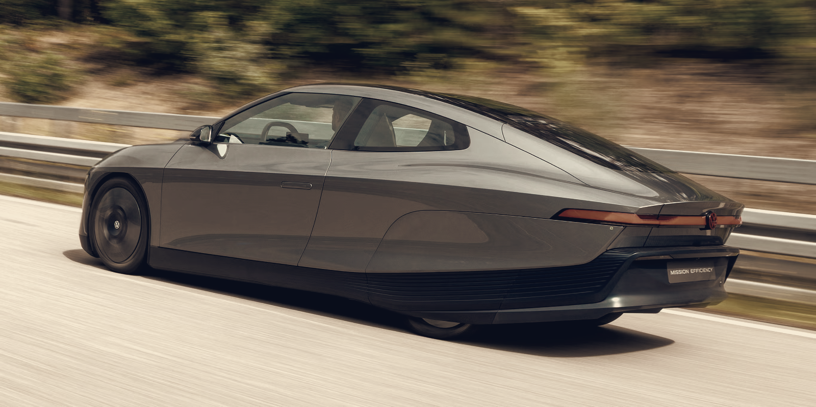

Lettering is moving from a brand afterthought to a structural part of car design as manufacturers increasingly replace small chrome emblems with their full written names. The change alters how vehicles are read at a glance, because a word occupies horizontal space, follows body lines, and interacts with lights and creases in ways a tiny badge cannot.
Skoda’s Elroq illustrates the shift, with the brand name occupying both the front and rear and becoming a hallmark of its Modern Solid design language. Designers are treating letters like any other exterior component, positioning them to balance taillights, follow light bars, and create a visual rhythm across the rear surface. Lancia and DS Automobiles apply the same principle with very different typefaces and spacing, showing the approach can be tailored to each brand’s character.
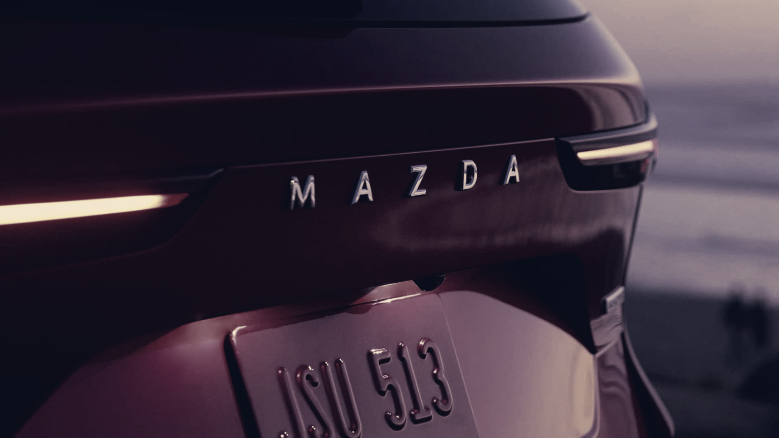
This is not entirely new: Porsche has long used its full name on the 911’s rear and Volvo has often favoured lettering over a stand-alone badge. What has changed is the intent. Brands now design type with the same care they apply to headlights, wheels, and body panels. Mazda uses restrained, clean lettering across its lineup, while Peugeot integrates its name into a rear light bar and even illuminates it, turning typography into a lighting and graphic feature.
Beyond the physical car, lettering also carries across marketing and digital channels, unifying visual identity from brochures to on-screen assets. That consistency matters as automakers simplify surfaces and reduce decorative clutter. With more manufacturers entering the market, especially from Asia, a spelled-out name guarantees instant recognition regardless of regional badge familiarity.
Traditional emblems are unlikely to vanish; they remain potent symbols of heritage and still serve branding needs in the electric era. Still, the written name is becoming more prominent on newer models, both as a practical identifier and as a deliberate design element. Expect typography to be treated as part of vehicle architecture on future launches, used to define proportions, highlight lighting treatments, and help cars read as cohesive brand statements.